New Website

http://mindblossomfilms.wix.com/mindblossomfilms

For our last multimedia project we had to design a website for future promotional purposes and produce a 1 minute minimum show reel. I chose to use Wix for designing my website. The first thing I had to decide was what I wanted to call my website, I wanted to have a unique company name I researched lots of names on random production name generator websites and I researched to see if ones I liked were taken. I eventually went with Mind Blossom Films. I chose this name because I felt it suited the creativity of producing videos, like it’s a mind blossom. I think it sounds different and inventive. Once I had decided on a name I felt it would be a good idea to create my own logo to display on the website and on the social media pages I have connected to it.

logo1 MBF Logo1

The logo on the right is primarily used for social networking websites or for smaller purposes. I chose this design from looking at some graphic websites and thought it looked different but also feminine to go along with my branding. I liked the idea of using blues in the logo as it is a calm but bright colour. When creating my website I went for a similar theme by choosing a palette of blues, grays, white and black.

The pages I wanted to have on my website would be a homepage, a showreel page, a film’s page, a photography page, a about me page and a contact me page. In the end I decided to not create a showreel page to just insert my showreel onto my homepage that way it is easier for visitors to see it and watch it and it seemed a waste to have a page just for my showreel.

I made it so there was 3 links to social media – my Vimeo, my blog and my Facebook page.

homepage

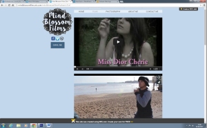
This is what the homepage looks like.As you can see the colour theme of black, white, grey and blue.

I wanted the menu bar obviously for navigation, my logo, my social media links and my showreel to be the prominent part of the page. I also added an email me button which links to my contact me page. I am not sure if this was a good idea now due to there being a contact me button but i thought it would make it easier for visitors to email me. I also added some text above my showreel to introduce the visitors to my website and to point out my showreel below it so they knew what it was. It looked a bit plain without the text so i felt this was a good idea.

films

This is what the film’s page looks like. I put a select variation of films on there that I believe is some of the best work I have contributed towards.
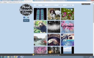
photosThis is what the photography page looks like. I have uploaded all of my best photographs to this page. I had to copyright each one with the text ‘mindblossomfilms’ just to be sure no one can use my work as their own. I tried to make sure the copyright text on each photo was not too noticeable but in an annoying place where it can’t just be cropped or painted over in Photoshop. I chose this gallery type as i believe it showcases them in the best light and the viewer has the option to click on each photo if they want a closer look.

about meThis is what the about me page looks like. I wanted to add this page to give the viewer an overview of who the company is represented by what I am currently doing education wise and how I would love to offer my services to anyone. I decided that the page looked too boring to have just some text about myself so I went ahead and added a couple of photos of me with cameras to go along with the theme of the website and what I do.

contact me

This is what the contact me page looks like. I thought it would be best to include my email as well as a form depending on how people want to contact me it gives them their freedom rather than having to fill in a form as well as others who like to be more detailed with their enquiries. The background of this page is a screenshot from the location video I worked on of Tout Quarry. I think it goes well with the theme and the page would be very plain without it. I have removed the contact me button from this page as it doesn’t make sense to have it linked to the page the visitor has already navigated to.

Overall I am very happy with my website and I think it shows off my skills well. I think that the homepage needs more to it and so does the about me. Maybe I could add more recent work to the homepage and on my about me page I could add filmography or like a CV to it.

I am happy with my showreel it is a little bit longer than we were briefed to produce but that’s because of the variety of work that I have been involved in that I wanted to include. I included old and new work and tried to put it in a random order and edit to the beat as much as possible. I wanted the showreel to be exciting and be different and i think i have achieved this. I wish I had uploaded the showreel to YouTube as the option to view the showreel is only in standard definition when you embed a video from Vimeo. I might change this in the future.

https://vimeo.com/129660526 is the link for my showreel.

3D Modelling and Tracking of a Building

For this clip i was inspired by shots included in films where a bomb would land on a building. I decided i wanted to do something similar but not with a bomb as i felt my knowledge of Matchmover and Maya wasn’t advanced enough to create a bomb along with an explosion and debris. So instead i decided it would be different to create a sort of blanket or table-cloth to fall onto a building.

With the use of Matchmover, i tracked all the points of a panning shot of a building on Portland. I then had to take that file into Maya and construct a sort of shell of the building and where all the ledges are etc to give the programme an idea of where the cloth should be dropping and where the shadows should be appearing.

Then i had to create the cloth and i applied a colourful checkerboard design to it. There is also a camera view involved in the video as in the perspective view the construction of the building is visible.

After this i had to render all of the frames out into images which took a very long time. Eventually it had finished rendering and i was able to import all of the images into Adobe Premiere Pro CS6. I had to lower the minimum frame value of stills in the properties to easily create the video without resizing every still, considering there is around 300 of them.

I don’t have a breakdown/any screenshots of the project at the moment i will update this later.

The final video is below.

I am satisfied with the final outcome of the video clip but there are parts i am not as happy with for example there is a small ball in the frames that flies down vertically against the building I believe this is a tracking point and I was under the impression it would be invisible but it is not and I would try my best to change this if I could redo it. Also there are some edges visible and have some shadow around the construction of the building I made, I am not sure why they are visible as I could not see them when i did pre-renders.Soi would need to find out why they are there and how to change that if I wanted to change the clip. I have also noticed that the cloth doesn’t fall where it should on the ground when it gets to the bottom of the frame, I thought I had rectified this and made it so it drops where it should but for some reason it drops where the steps are so I would need to change this if i had to redo it as well.

Rocket 3D Modelling

I was inspired by the film Gravity to create a sequence of a rocket in space and the interior of the rocket. I decided to use the 3D software by Autodesk called Maya. I created 7 different sequences of a rocket flying through space, the planets in space, the inside of the rocket, birds eye and close up shots of the rocket coming towards the screen. This involved modelling the rocket first of all which was done by using the polygons tool and extruding and adjusting the edges etc to create the shape desired. The planets/space was created by using textures and shaders. The interior of the rocket involved looking at different images on Google and taking inspiration as to what sort of things are in a real rocket and including what i thought would look good in my particular creation. The fire was a particle effect used in the programme.

I used 3D modelling for this clip. After i completed each sequence, they were rendered in Maya individually as images to which i then edited them all into one video for this assignment with the programme Adobe Premiere Pro CS6. Then i uploaded it to Vimeo. Unfortunately, i do not have any screen shots of this project i worked on in Maya as my external hard drive broke that had the project files on.

I am mostly happy with the results of this clip. I think it looks well put together as a sequence but i also feel that it is very obvious that there is two different designs of the rocket in it as i had to model a second rocket due to my project file disappearing. I also wish i had added more texture and colour to the interior of the rocket.

The final video is below.

Cinemagraph idea

I have found inspiration in the art of cinemagraphs from Ann Street Studio’s website. The cinemagraph i was inspired by is below. The website link for this cinemagraph is http://annstreetstudio.com/2012/01/11/hookah-by-fire-light-puma-takes-us-on-a-desert/.

I have decided i want to make my own cinemagraph and have come up with a few ideas.

6680460661_05b320c8da_o

The first idea i had inspired by the above would be to create a cinemagraph of my dog sitting in front of a fireplace and the fire roaring behind him.

To do this, i would need to take a photo of my dog by the fire and capture a video of the fire roaring and my dog sitting there. I would then need to mask in the fire roaring into the photograph. I used two video tutorials to make my cinema graph.

I used Adobe Photoshop CS6 and After Effects CS6 to mask and separate the video into layers by rasterising it. I also slowed down the fire roaring as i felt it was too fast and it would look more realistic if it was slower. The GIF is also colour graded with curves and levels to make it look less red toned. I also removed some grain. I am not sure why but the video and photographs i took were slightly grainy, the only reason i can put this down to is that the lighting was not great so in the future i am going to make sure i used external lighting in my projects.

grain and mask

(Details of the remove grain i used and the mask i drew)

levels curves

(The curves and levels effect settings i used).

The final cinema graph i created is below.

Untitled-3

I am very happy with the results. I am only unhappy with the low quality of the GIF. I tried to find different ways to resolve this but it seemed like there is not much you can do about it.

Colour Grade

I was inspired by this video on Vimeo.

I think the video above is so ethereal and professionally done it must have taken a long time to get it to that high standard of perfection.

I wanted to create a shot that felt like it was in the same forest with the same sort of colour grading – dark and mysterious.

For some of my show reel i filmed some clips in Lodmoor Country Park. I got a nice shot of some foliage on a tree and decided to colour grade it to make it more of a ‘forest at winter’ look with shades of green and blue in it.  For this I used, Adobe After Effects CS 6.

I also felt that the clip was quite ‘grainy’ for some reason, i think it was to do with the ISO setting I had on my camera at the time of filming. I used the ‘remove grain’ effect control to take some of this out. For the colour grading I used the Curves, Levels and Colour Balance effect controls.

Below are some screenshots of the effect controls i used.

Curves and Levels Remove Grain and Colour Balance

I am very happy with the overall clip of the colour grading as i feel it conveys the ideas that i originally set out to do. I would have liked to film and edit the clip again as i feel the graininess is too visible for my liking. I would need more guidance on how to film this clip with more lighting and more attention to the ISO in the future to make it less grainy. I also feel that a macro lens would be a good investment for these types of shots, especially if i were to do a video like the inspiration for the said clip above.

The video below is a final breakdown of the colour grading i did for the clip.

Sahara

For our current assignment we are to make 5 clips which include our own visual effect content for our future showreels. We are to include : Greenscreen, set extension, 3D modeling, 2D and 3D camera tracking, compositing, and colour grading.

I was researching green screen techniques and found that the film ‘The Great Gatbsy’ had some great scenes where green screen was used by the visual effects company Rising Sun Pictures, i was inspired simpy the scene of Mr Gatsby raising a glass with fireworks going off behind him. It inspired me to make a scene where someone would be infront of a different background. This is where my idea came from to make Dan look like he was in Sahara Dessert with the wind flowing through his hair.

I have linked the video and screenshotted the scene i am referring to below :

Untitled-1

(Video Here)

For my first clip I am using the techniques of green screen and set extension. The clip consists of my classmate Dan walking on sand dunes in the Sahara. The clip was filmed in the TV studio with a greenscreen background and an assistant to ‘flap’ a piece of cardboard as if the wind was hitting his hair. For this clip I used Adobe After Effects CS6 and Adobe Photoshop CS6.  Before I chroma keyed the footage I had to Photoshop the background to get rid of some people in the background otherwise you would be able to see errors with proportions of them to Dan.

Here is an image of the original and the people in the background gone. peopleno people screenshot2

The screenshot above shows what the image & video clip of Dan looked like once it was chromakeyed onto the background. I then found there was part of the video clip which looked odd around his top and discovered it was because there is some green on his t-shirt.

screenshot

To get rid of the funny parts around his t-shirt I had to mask it for each movement in the video clip to make it so the chromakey does not affect the colours in his t-shirt.  Once I had finished the chroma keying and masking, I needed to colour correct the scene to make it as though Dan was definitely in the Sahara, for this I used curves, brightness and contrast, colour balance, levels and i also added grain. I then added a vignette effect around the edges to make the clip slightly more ‘older’ looking. The video below is a breakdown of the clip i made.

<p><a href=”http://vimeo.com/111724923″>Sahara Breakdown</a> from <a href=”http://vimeo.com/user5630482″>Christina Vincent</a> on <a href=”https://vimeo.com”>Vimeo</a&gt;.</p>